Redesigned an app to simplify mental health support by recommending tools based on users' emotions, improving engagement and accessibility.
Roles & responsibilities
My Role:
UX Designer, UI Tester
Timeline:
8 Weeks
Team:
UI Designer, Product manager
UX/UI Design
Mental Health
App / website
Note: I've left out the client’s name to respect confidentiality.
Where it all started
Mental Health Support Shouldn’t Feel Overwhelming
Seeking help for mental well-being should be easy and intuitive, but users of this mental wellness platform felt lost and overwhelmed.

Not a lack of content, but too much of it. Users opened the app seeking relief, only to be met with a wall of choices.
Not a lack of content, but too much of it. Users opened the app seeking relief, only to be met with a wall of choices.
The app provided thousands of expert-backed tools—therapy exercises, guided meditations, articles, and more. But instead of feeling supported, users struggled to find the right resources, leading to low engagement.
Goals
Our goal was to make mental health support more accessible and personalized by tailoring recommendations to users' emotions. By introducing mood-based check-ins, curated tool suggestions, and gentle therapy nudges, we created a more intuitive and supportive experience, reducing overwhelm and increasing engagement.
Research & Exploration
Understanding the gaps – Why weren’t users engaging?
Before jumping into solutions, we needed to understand why users weren’t connecting with the app.
Who were the users
The platform supports employees from partnered organizations, providing them with personalized mental wellness tools. These users often struggle with work-related stress, burnout, and mental fatigue but may not know where to start when seeking help.
Users felt overwhelmed
The platform had plenty of great tools, but with no clear entry point, users didn’t know which one to pick.
Mental health is personal
A one-size-fits-all approach wasn’t working; users needed a journey tailored to their needs.
Other platforms personalised the journey
The most engaging platforms first understood the user before offering solutions.

//current flow
The app needed to meet users where they were emotionally, guiding them to the right support.
The Solution
The Approach – Let’s start with how users feel
Instead of forcing users to sift through thousands of tools, we redesigned the experience around mood-based recommendations.
The app needed to meet users where they were emotionally, guiding them to the right support.

//Process

#1
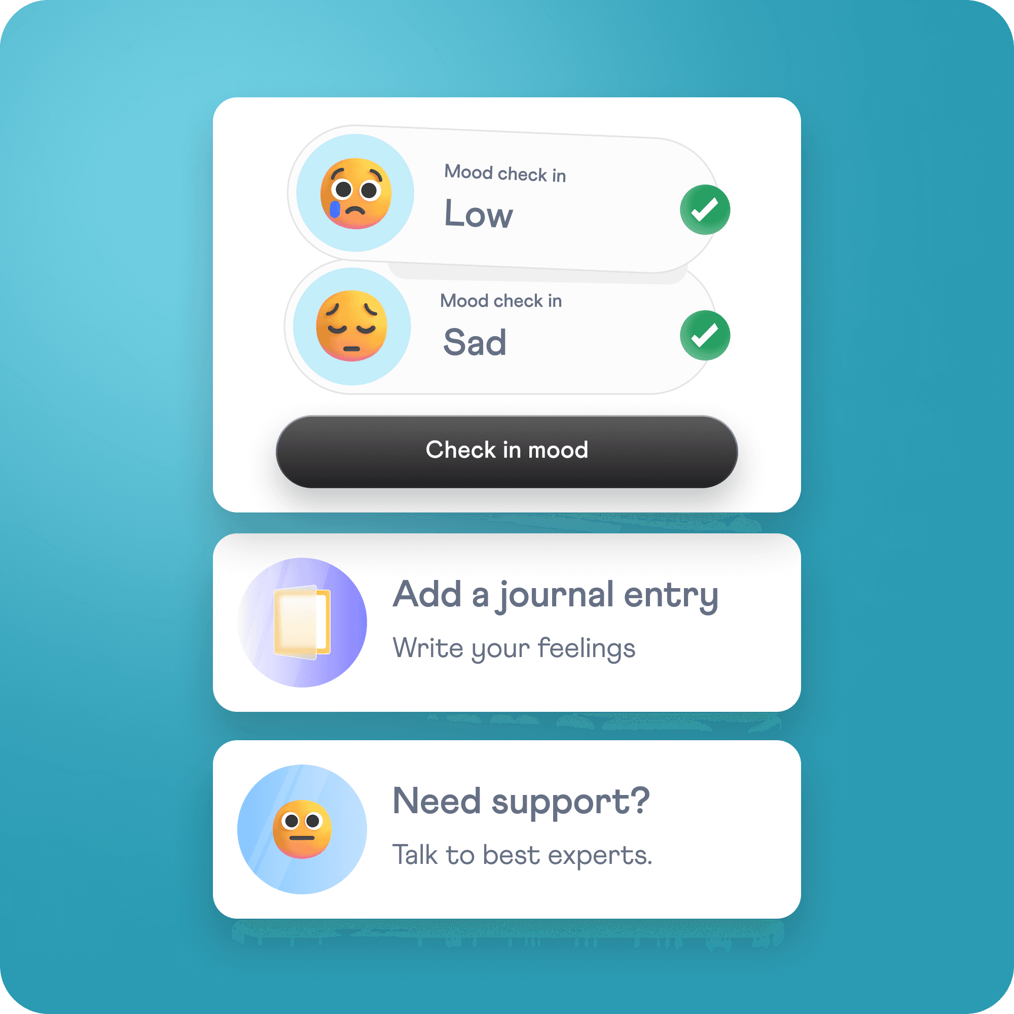
Mood Check-in
Users start by selecting how they feel, what triggered their current feelings, helping the app understand their emotional state.

#2
Personalized Suggestions
Instead of a long list, users get five handpicked tools tailored to their needs and options to explore more.

#3
Smart Nudges for Counselling
If a user still feels low, they receive gentle prompts to seek counselling or deeper support.

#4
Explore all content
A categorisation of all the tools for easy access and explore them based on how user is feeling.

My work at Thence are under NDA.
While I can’t share much here, I’d love to discuss about my design process and approach.
Feel free to email me to learn more about my work!
Drop a mail at
anshitanair2000@gmail.com
Impact & Results
This wasn’t just an app redesign—it was a shift from information overload to an intuitive, human-centered mental wellness experience.
Higher engagement as users spent more time interacting with tools.
Many users shared that the app felt more intuitive, supportive, and less overwhelming, making their mental wellness journey smoother.
Learnings
Sometimes, the best design decision isn’t adding more features—it’s making what already exists more accessible and intuitive.
With thousands of tools, users didn’t know where to start. We restructured content discovery, making the platform more intuitive.
Reducing friction and guiding users through small, meaningful steps made engagement effortless.

Thank you for exploring my work. Have a great day!